

Color Grading in Brand Video: What Marketers Must Know
Updated: 3 days ago

Color grading is the creative process of intentionally manipulating color, contrast, and tone in post-production to shape mood, reinforce brand identity, and prime viewers emotionally before a single word is spoken. It is not the same as color correction. Correction is the technical baseline work: balancing white balance, fixing exposure, and neutralizing inconsistencies across shots. Grading comes after that clean foundation and adds the creative narrative layer that makes a video feel like your brand.
Here is what color grading actually does in a brand video:
Sets mood immediately. Warm amber tones signal approachability and energy; cool blues and teals communicate precision and institutional trust.
Reinforces brand identity. A consistent visual palette across every video tells viewers who you are before the logo appears.
Primes emotional response. Viewers absorb color cues subconsciously, forming judgments about credibility and tone within seconds.
Creates a signature look. A well-executed grade makes your content recognizable across platforms and formats.
Brands treat grading as a core branding tool in 2025 and 2026, not a finishing touch. The visual finish is the first promise your brand makes on screen.
How color grading shapes emotional impact and brand consistency

Color works faster than dialogue. Research shows that people form a subconscious judgment about a product within a short time, with a large portion of that judgment influenced by color alone. Consistent color grading can increase brand recognition by up to 80%. Those numbers explain why grading deserves a budget line and a creative brief, not just a quick pass at the end of post-production.
Different color palettes trigger predictable emotional responses:
Cool tones (blues, teals, desaturated silvers): Analytical precision, institutional scale, emotional restraint. Common in financial services, enterprise technology, and healthcare videos.
Warm tones (ambers, golds, elevated reds): Energy, approachability, human connection. Favored by consulting firms, creative agencies, and purpose-driven brands.
High contrast, desaturated looks: Sophistication and precision. Signals that every detail is intentional.
Soft, warm, saturated palettes: Intimacy and affection. Works well in community-focused or lifestyle storytelling.
Inconsistency is the real danger. Inconsistent grades reduce brand trust and authority, because viewers read visual instability as a lack of care. A corporate testimonial video that shifts color temperature between shots tells the audience, without a word, that the production was assembled rather than crafted. That perception bleeds into how they feel about the brand itself.
The role of visual storytelling through grading goes beyond aesthetics. A skilled colorist binds individual clips into a cohesive narrative, communicating values like trust, warmth, or precision before any dialogue lands.
What marketing teams should know about the technical process
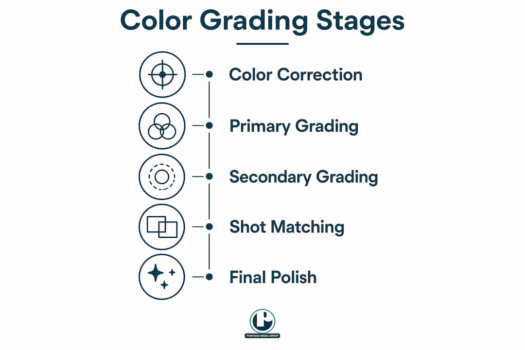
Understanding the workflow helps you manage quality, not just approve deliverables. Professional color grading follows a three-stage pipeline, and the order is not negotiable.
Stage 1: Color correction. Every shot is balanced for exposure, white balance, contrast, and skin tone. This creates a neutral, technically clean image. Skip this step and any creative grade applied afterward will behave unpredictably, because each clip has different uncorrected problems underneath.
Stage 2: Primary and secondary grading. The signature look is applied across the film. Primary grading affects the whole image: global mood, temperature, and contrast. Secondary grading uses masks and qualifiers to target specific elements like faces, brand colors, or key products. This is where LUTs (Look-Up Tables) live. A LUT applied to properly corrected footage behaves exactly as designed.
Stage 3: Polish and matching. Shot-by-shot matching, skin tone protection, and final contrast refinement. A subtle vignette draws focus; selective adjustments keep skin tones accurate after a creative grade shifts the overall palette.
Two tools separate professional grading from amateur work. Colorists rely on Waveform and Vectorscope scopes for objective measurements of luminance and color, because the human eye adapts to ambient light and cannot be trusted as the sole reference. At the technical precision end, Tetrahedral LUT interpolation prevents color banding artifacts that would otherwise signal amateur output on professional displays.
Software used across the industry includes DaVinci Resolve (the standard for dedicated color work, with a node-based architecture and professional scope suite), Adobe Premiere Pro with Lumetri Color, and After Effects for projects where grading is integrated with compositing or motion graphics.
Pro Tip: Brief your colorist before the shoot, not after the edit. Share a mood board of reference images and describe the emotional state you want viewers to experience. That conversation shapes lighting decisions on set, which directly affects what grading can achieve in post.
Why color grading is a marketing asset, not a post-production afterthought
Credibility is visual before it is verbal. Viewers rarely articulate that the color grading felt off. They simply read the video as less polished, less trustworthy, or less professional than intended, and that perception sticks to the brand.
“Colour is more than aesthetics. It’s emotional engineering. Brands are finally treating colour grading as more than a finishing touch. It’s becoming part of the brand book, a signature visual style reinforcing brand memory.”
Here is why marketing teams should treat grading as a strategic priority:
Professionalism is perceived, not stated. A thoughtful grade quietly signals premium quality; a careless one signals generic, regardless of how clean the logo is.
Consistency across formats builds recognition. Every TV commercial, corporate testimonial, and social cutdown should live in the same emotional temperature, even when the content differs.
The wrong look undermines credibility. Over-glossy grades can make testimonial and interview content feel managed rather than believable, which is exactly the wrong signal when trust is the goal.
Color signals brand values before copy does. In a world where brands have seconds to connect with a scrolling audience, the grade delivers emotional resonance before any tagline is read.
Think about how Apple’s cool precision or Patagonia’s grounded naturalism reads instantly on screen. That is not accidental. It is the result of treating color as a brand asset with the same discipline applied to typography or logo usage.
Best practices for integrating color grading into your production
The most common mistake marketing teams make is treating grading as the last box to check. By the time footage reaches the colorist, many of the decisions that determine what grading can achieve have already been made on set.
Control your lighting on location. Mixed lighting (daylight, warm bulbs, overhead office fluorescents, and colored ambient sources in the same frame) pushes skin tones and neutral areas in different directions. A grade can improve a lot, but it cannot fix blown highlights or poorly lit faces.
Choose locations that photograph well. A space that looks great in person can create serious color problems on camera. Ask how it will photograph, not just how it looks.
Specify camera systems and log profiles in advance. For multi-location campaigns, a reference LUT shared across shoot teams gives the colorist a consistent starting point before creative decisions begin.
Avoid one-size-fits-all presets. A single preset look rarely serves all content types. A grade that works for a product launch video may undermine the believability of a customer interview.
Brief your production team on color intent early, the same way you brief on messaging. That conversation belongs in pre-production, not the edit review.
Pro Tip: Build a documented color style guide for your brand’s video content. Include reference stills, approved LUTs, and notes on emotional intent for each content type. This makes grading repeatable across productions and vendors, so your brand looks consistent whether a video is produced in Q1 or Q4.
A video style guide that covers color alongside typography and motion standards is one of the most practical tools a marketing team can maintain.
Expert perspective from Puritano on color grading as a brand asset
At Puritano, we’ve spent over two decades watching color grading separate brands that look professional from those that merely look produced. The difference is almost never budget. It’s intention.
The advanced techniques that separate premium work from adequate work are worth understanding. Split grading, combining warm highlights with cool shadows, creates visual depth that the eye reads as cinematic without the viewer knowing why. It is borrowed from feature film colorists and is now standard in high-end brand video. Scope-based skin tone adjustments, using the Vectorscope to keep faces accurate after a creative grade shifts the overall palette, are what keep interview and testimonial content believable rather than processed.
We also involve clients in the grading process directly. Showing stakeholders the effect of color decisions in real time, rather than presenting a finished grade for approval, produces better outcomes. Creative collaboration in the grading suite means the final look reflects the brand’s actual values, not just a colorist’s aesthetic preference.
The brands that get the most from their video investment are the ones who treat the visual quality of their production as inseparable from their brand reputation. Color grading is not decoration. It is the final creative decision that determines whether your video earns the trust you worked to build everywhere else.
If you want to see what intentional grading looks like in practice, Puritano’s portfolio shows the range of work we bring that discipline to across formats and industries.
Key Takeaways
Color grading shapes brand video perception through emotional tone, visual consistency, and technical precision, making it a strategic asset that marketing teams must brief and budget for from the start of production.
Point | Details |
Grading vs. correction | Correction creates a neutral baseline; grading adds the creative mood and brand tone that defines how viewers feel. |
Color drives fast judgments | Between 62–90% of a viewer’s subconscious product judgment is based on color, formed within roughly 90 seconds. |
Consistency builds recognition | Consistent color grading can increase brand recognition by up to 80%. |
Brief early, not late | Colorist briefings belong in pre-production; lighting decisions on set determine what grading can achieve in post. |
Document your color standards | A color style guide with reference stills and approved LUTs keeps grading repeatable across productions and vendors. |
Recommended
A brand's palette only works if the person grading understands what the brand is trying to say. Charlie Puritano sits in the edit on our projects, and his eye was trained in work where look is the message, including music videos he directed for MTV artists. That experience shows up in brand work as restraint: a grade built around the identity the client already owns, applied consistently across every cut and format, rather than a fashionable filter that fights the logo. The viewer's first impression should match the brand, not the trend.


Comments