

Color Grading vs Correction: What Actually Sets Them Apart
Updated: Aug 21

Color correction is the technical fix. Color grading is the creative choice. Correction neutralizes exposure, white balance, and stray color casts until footage looks accurate and matches shot to shot. Grading then takes that clean baseline and stylizes it, building the mood, palette, and visual identity that make a piece feel like something rather than just look like something. Correction happens first, grading second, and that order isn’t a style preference. It’s a structural requirement.
Here’s the simplest way to remember it: correction makes footage accurate. Grading makes footage intentional. One source calls this exact framing out because it clarifies which controls belong to which job and keeps editors from wasting time grading footage that still has a green color cast from bad office lighting.
Skipping correction and jumping to grading is like trying to paint a mural on a cracked, uneven wall. The crack shows through no matter how good the paint job is. If skin tones are magenta before you grade, they’ll be an off-brand magenta after you grade too, just with a teal filter over it.
Primary goals, side by side:
Color correction aims for neutrality: matched exposure across shots, accurate white balance, removed color casts, natural skin tones.
Color grading aims for feeling: a consistent look, an emotional palette, a visual signature that separates one project from a thousand others shot on the same camera.
Pass | Goal | Comes first? |
Color correction | Technical accuracy and consistency | Yes |
Color grading | Creative mood and style | No, always second |
Pro Tip: If you can’t tell whether a shot problem is a correction issue or a grading issue, ask this: would a colorist working blind, with no creative brief, need to fix this just to make the shot usable? If yes, it’s correction. If it’s about mood, it’s grading.
Key Takeaways
Color correction fixes technical problems to build a neutral, matched baseline, and color grading stylizes that baseline into a deliberate mood, in that exact order, every time.
Point | Details |
Correction comes first | Always neutralize exposure, white balance, and casts before applying any creative grade. |
Skin tones are the tell | Check skin tones on the vectorscope before and after grading to catch drift early. |
LUTs are starting points | Apply LUTs after base correction, never as a substitute for it, to avoid crushed shadows. |
Grading can’t fix bad capture | Underexposed or poorly white-balanced footage limits what any grade can achieve. |
Puritano corrects before it stylizes | Every brand and event project gets a full correction pass before creative grading begins. |
Color Grading vs Correction: Defining the Technical Pass
Color correction is the objective, rules-based pass that gets footage to a neutral, matchable baseline before anyone thinks about style. It handles exposure, white balance, contrast, saturation, and any color casts introduced by mixed lighting, sensor quirks, or a camera operator who forgot to set a custom white balance in a fluorescent-lit conference room. The goal is consistency: shot one and shot fifteen from the same scene should look like they belong together, even if they were filmed hours apart with the sun in a different position.
This pass runs after picture lock and before grading or VFX handoff, and the sequencing matters more than most editors assume. Grading uncorrected footage risks unstable skin tones and looks that fall apart the moment you switch shots, because you’re stacking a creative decision on top of an unresolved technical problem. Fix the foundation first. Style it second.
The correction checklist colorists actually run
Pull up your scopes before touching anything. Waveform for exposure, vectorscope for hue and saturation, histogram for the full tonal range. Trust the scopes over your monitor, especially if your monitor isn’t calibrated.
Set white balance and neutralize color casts. Look for a genuinely neutral gray or white element in frame if one exists, and use it as your reference point.
Match exposure and contrast across the scene. Every shot in a sequence should read at roughly the same brightness unless the story calls for a deliberate shift.
Match shot to shot within a scene. This is where continuity lives. A wide and a close-up filmed minutes apart on different lenses need to feel like the same moment.
Fix skin tones last, and check them against the vectorscope’s skin tone line. This is the detail viewers notice even when they can’t articulate why a shot feels “off.”
A common failure case: an interview shot near a window during the day picks up a strong blue cast on one side of the subject’s face while practical lights add warmth on the other. The fix isn’t a single white balance slider. It’s isolating the cool side with a mask, warming it to match, then confirming with the vectorscope that both halves of the face sit on the same skin tone line.
Pro Tip: Skin tones drift more than any other element in a frame, and they’re the one thing every viewer subconsciously judges as “right” or “wrong” even without color training. Check them first, check them last, and check them again after grading.
Correction is unglamorous work. Nobody compliments a beautifully corrected shot at a screening. But every graded look you’ll build in the next section depends entirely on how well this pass gets done.
What Color Grading Actually Changes
If correction is the cleanup crew, grading is the art department. This is where a colorist takes that neutral, matched footage and pushes it toward a specific emotional register: the teal-and-orange contrast of a modern action film, the desaturated blue-gray of a prestige drama, the warm golden wash of a nostalgic memory sequence. Grading is a stylizing pass built on top of the corrected base, and it’s where a project’s visual identity gets decided.
Colorists treat this as storytelling, not decoration. A shift toward sickly green signals unease; warm amber tones read as nostalgia, and those choices get made deliberately, shot by shot, to unify the emotional beats of a scene rather than just make things “pop.”
The techniques that make up a grade
LUTs (Look Up Tables) as starting points, not finished products. They apply a preset transform to color and contrast, giving you a fast baseline to refine.
Primary adjustments affect the whole image: overall lift, gamma, gain, global saturation and contrast.
Secondary adjustments target specific colors or regions, isolating a sky to deepen its blue or pulling saturation out of a background without touching skin tones.
Power windows and masks let you treat one area of frame differently from the rest, brightening a face while letting shadows stay dark.
Vignettes draw the eye toward a subject by subtly darkening the frame edges.
Look design ideally starts before a single frame is shot, and following a fast, efficient production workflow helps ensure that lighting and wardrobe can be adjusted early to support efficient grading later (fast video production guide). Directors and cinematographers who bring reference images to a pre-production meeting, and colorists who join dailies review during the shoot, catch problems while there’s still time to adjust lighting or wardrobe. Waiting until the edit is locked to think about the look means discovering, too late, that a wardrobe choice clashes with the intended palette.
LUTs get treated as a shortcut, and that’s exactly where they cause trouble. They’re built for a specific input color space, and dropping a look LUT onto uncorrected log footage often crushes shadows and pushes skin tones toward orange or magenta in ways that are hard to undo cleanly.
Pro Tip: A LUT is a starting point, never a finished grade. If a LUT looks great on one shot and terrible on the next from the same scene, that is not the LUT’s fault. It’s a sign the correction pass underneath was not consistent yet.
Correction vs Grading, Side by Side
Putting both passes next to each other makes the practical differences obvious fast, especially for anyone briefing a production team or trying to explain to a client why “just add a filter” isn’t how professional color work happens.
Factor | Color correction | Color grading |
Primary goal | Technical accuracy, neutral baseline | Creative aesthetic, mood, and style |
Typical tasks | White balance, exposure matching, contrast, removing casts, skin tone fixes | LUTs, secondary adjustments, power windows, vignettes, palette design |
Pipeline position | After picture lock, before grading | After correction, before final QC |
Common tools | Scopes, primary color wheels, basic correction panels | LUTs, curves, masks, plugins like Boris FX |
Deliverables and checks | Broadcast-safe levels, matched skin tones, consistent exposure | Consistent mood across scenes, calibrated-monitor review |
Correction can occasionally be minimal, if footage was shot under controlled, consistent lighting with a calibrated camera setup, correction might take twenty minutes instead of two hours. Grading, on the other hand, is rarely optional if a project has any creative ambition at all, and it can’t compensate for a correction pass that got skipped. Underexposed or wrongly white-balanced footage limits what grading can achieve, and pushing a bad grade to compensate usually just reveals the underlying capture problem more clearly, with banding, noise, or blown highlights becoming impossible to hide.
Scenario check: a solo creator shooting a talking-head vlog in consistent daylight might do a light correction pass and call it finished, since the creative stakes are low and consistency matters more than mood. A narrative short film with multiple locations and a deliberate visual identity needs both passes done properly, with real time budgeted for each.
Pro Tip: If you’re only going to do one pass well, do correction well. A well-corrected, ungraded video still looks professional. A poorly corrected but heavily graded video looks like a filter slapped on a mistake.
Building Correction and Grading Into Your Post Schedule
The order matters, and so does the timing. A realistic post-production pipeline runs: offline edit, picture lock, conform or online edit, color correction, color grading, then final quality control and delivery. Skipping ahead, especially grading before picture lock, creates rework that costs more time than it saves.
Offline edit. Story and pacing get locked using low-resolution proxies or unfinished footage. Nobody should be thinking about color yet.
Picture lock. The edit is finalized. No more cuts, no more reordering scenes. This is the signal that color work can begin.
Conform or online edit. Full-resolution footage replaces proxies, and technical prep happens for the color pass ahead.
Color correction. Every shot gets neutralized, matched, and cleaned. Skin tones get checked scene by scene.
Color grading. The creative look gets applied across the corrected footage, scene by scene, then reviewed as a full sequence for consistency.
Final QC and delivery. The graded master gets checked on a calibrated reference display and against delivery specs before export.
For a short branded video or social clip, budget roughly a half day for correction and a half day for grading on a tight turnaround, more if the footage came from multiple cameras or mixed lighting conditions. For long-form work, a documentary or a narrative feature, correction and grading can each take multiple days spread across weeks, especially with a colorist doing scene-by-scene passes and director review rounds.
Project type | Typical correction time | Typical grading time |
Social clip or short brand video | 1 to 4 hours | 2 to 6 hours |
Corporate or event video (10 to 15 min) | Half day | Half day to 1 day |
Documentary or narrative short | 1 to 3 days | 2 to 5 days |
Pro Tip: Never let anyone grade before picture lock. If the edit changes after a scene is graded, that shot might get re-cut, re-timed, or dropped entirely, and the grading work goes with it. If you need to share creative direction with a colorist early, send reference stills or clips instead of grading temp footage.
Editors who structure their own workflow around this order, even on small projects, tend to develop faster instincts for spotting correction problems before they ever open a grading panel. The practical guide to blending correction and grading in post covers how editors and colorists hand off work cleanly between these stages.
Software, Plugins, and Hardware Worth Knowing
The tools you use matter less than the order you use them in, but a few names come up constantly, and it’s worth knowing where each one fits.
DaVinci Resolve is the industry standard for dedicated color work, built around a node-based system that separates correction and grading nodes cleanly. Its free version includes professional-grade scopes and color tools, which makes it the most accessible entry point for anyone serious about learning color.
Adobe Premiere Pro handles correction and light grading well inside a broader editing workflow, using Lumetri Color panels. It’s the practical choice for editors who need to cut and color in one application without switching software mid-project.
Final Cut Pro offers solid built-in correction tools and works efficiently for Mac-based editors, though its grading toolset is lighter than Resolve’s dedicated node system.
LUTs function as either input transforms, converting log or raw camera footage into a workable color space, or look LUTs, applying a stylized final treatment. Professional workflows often apply an input LUT at the start of correction, then a look LUT at the end of grading, and confusing the two is a common beginner error.
Boris FX, including its Continuum and Mocha toolsets, adds advanced plugins for tracking, masking, and stylized effects that extend past what a native grading panel offers, useful for complex secondary work like tracked power windows on a moving subject.
Tool | Best for | Cost model |
DaVinci Resolve | Dedicated correction and grading, node-based control | Free version, paid Studio upgrade |
Adobe Premiere Pro | Combined editing and color in one timeline | Subscription |
Final Cut Pro | Mac-based editing with built-in correction | One-time purchase |
Boris FX plugins | Advanced tracking, masking, stylized effects | Paid plugin, add-on to host software |
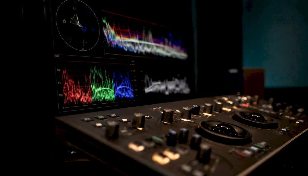
Hardware matters more than most beginners expect. A calibrated reference display is the difference between a grade that translates across a client’s laptop, a TV, and a phone screen, versus one that looks great on your uncalibrated monitor and wrong everywhere else. Serious color suites also use control surfaces, physical panels with dedicated wheels and knobs for lift, gamma, and gain, because dragging sliders with a mouse for hours slows down creative decision making.
Color space matters too. Rec.709 remains the standard for most broadcast and web delivery, DCI-P3 covers digital cinema projection, and Rec.2020 supports HDR and wider-gamut delivery formats. Grading in the wrong space for your delivery target is a fast way to produce a master that looks correct in your suite and wrong everywhere it’s actually watched.
Calibrate your monitor to your target delivery space and lean on scopes rather than your eyes alone. Monitoring is the hidden failure point that catches even experienced editors working on an uncalibrated laptop screen.
A Correction Checklist and Three Grading Recipes You Can Reuse
Here’s a version of the correction checklist built for speed, the kind you can run through on a deadline without second-guessing each step.
Open scopes (waveform, vectorscope, histogram) before adjusting anything.
Set white balance using a neutral reference point in frame if one exists.
Match exposure and contrast to a target range across the whole scene.
Match shot to shot for continuity within the scene.
Neutralize any remaining color casts.
Fine-tune skin tones against the vectorscope’s skin line.
Confirm broadcast-safe levels before moving to grading.
Three grading recipes worth knowing:
Clean documentary look. Keep saturation close to natural, lift shadows slightly to preserve detail in darker footage, and avoid heavy secondary work. The goal is credibility, not style.
Warm, nostalgic look. Push midtones warm with a slight orange bias, lower overall contrast slightly, and add gentle film grain if the footage allows it without looking noisy.
Moody, desaturated look. Pull saturation down across the board, deepen shadows with a cool teal bias, and use a vignette to draw focus toward the subject’s face.
Lift the mids, cut saturation by a small amount, and drop a cool bias into the shadows. That’s a full sentence description of an entire grading recipe, and it works because it’s specific enough to execute without guesswork.
The 60/30/10 rule, borrowed from interior and graphic design, gives grading a simple palette framework: 60% of your frame’s color character comes from a dominant, usually neutral tone, 30% from a secondary supporting color, and 10% from a sharp accent. Applied to a grade, that might mean 60% desaturated cool gray-blue across the frame, 30% warm skin and practical light tones, and 10% a saturated accent color, a red jacket or a neon sign, that the eye lands on immediately.
Recipe | Palette strategy | One-line move |
Clean documentary | Natural saturation, lifted shadows | Preserve detail, avoid heavy secondaries |
Warm nostalgic | Orange-biased midtones, lower contrast | Push warmth, soften contrast |
Moody desaturated | Reduced saturation, cool shadow bias | Deepen shadows toward teal, add vignette |
Pro Tip: Build your recipe on a single representative shot from the project first, not the prettiest one. If the look survives your worst-lit shot, it’ll survive the rest of the timeline.
Where Correction and Grading Go Wrong Most Often
Most color problems trace back to a small handful of repeat mistakes, and every one of them is avoidable once you know to look for it.
Grading before correction. The most common structural error. It bakes technical flaws into a creative decision that’s expensive to unwind later.
Uncalibrated monitors. A grade built on a monitor with a color cast of its own will look wrong the moment it’s viewed anywhere else.
Over-saturating skin tones. Pushing warmth or saturation to make a grade feel richer often pushes faces into an unnatural orange range first, since skin sits in a narrow band that tolerates very little push.
Mixing color spaces. Applying a Rec.709 LUT to Rec.2020 footage, or grading for one delivery format while exporting for another, produces shifted colors that only show up after delivery.
Treating LUTs as finished looks instead of starting points, which tends to crush shadow detail and distort skin tones when applied to uncorrected footage.
A grade that looks stylish and moody on a colorist’s calibrated OLED reference monitor can look muddy, crushed, or oddly tinted on a client’s laptop or an old office projector. The fix is testing the export on at least two or three different displays before calling it final, not just trusting the suite it was built in.
Pro Tip: Check skin tones on the vectorscope’s skin line and exposure on the waveform before you sign off on any grade, no matter how good it looks by eye. Your eyes adjust to a look after staring at it for an hour. Scopes don’t.
How to Practice Correction and Grading on Your Own Footage
Skill here builds through repetition on real footage, not through watching tutorials passively. A few exercises build the right instincts fast.
Correct a mixed-light interview. Find or shoot footage with window light on one side and a lamp on the other, then practice isolating and matching the two.
Match two different cameras. Shoot the same scene on two devices, even two phones with different sensors, and try to make the footage indistinguishable after correction.
Grade with a LUT, then refine by hand. Apply a LUT to correctly graded footage, then adjust manually until the LUT’s flaws (crushed shadows, off skin tones) disappear.
Start with correction only, no grading, until matching shots feels automatic.
Add one LUT to a correctly corrected scene and study what it does to skin tones specifically.
Build a full recipe from scratch using the 60/30/10 framework on a short scene.
Export and review on at least two different screens before calling any project finished.
A useful, low-cost learning setup doesn’t require a professional suite. A single calibrated monitor, even a mid-range one profiled with a hardware calibration tool, paired with free scopes inside DaVinci Resolve, teaches more in a month of deliberate practice than hours of tutorial-watching without hands-on repetition. The role of cinematography in brand videos is worth studying too, since on-set lighting and exposure decisions determine how much correction work you’ll face before you ever touch a color panel.
Pro Tip: Study reference footage from projects you admire, frame by frame, using scopes rather than just your eyes. Reading the vectorscope of a shot you love teaches you more about intentional color choices than any written tutorial.
What This Means for Production Budgets and Timelines
Working across corporate, nonprofit, and branded video projects consistently shows the same pattern: clients underestimate correction and overestimate grading. They picture a colorist adding a filter at the end, when in reality most of the time in a color suite goes toward getting footage clean and matched before a single creative decision gets made.
The signal for handling color in-house versus bringing in a dedicated colorist usually comes down to three things: how many cameras and lighting setups were used during the shoot, how visually consistent the final piece needs to be across multiple scenes, and how much the client’s brand identity depends on a specific, repeatable look. A single-camera interview shot in one location with decent lighting is a reasonable in-house correction job for an experienced editor. A multi-location brand campaign that needs to look identical across a dozen videos over a year benefits enormously from a dedicated colorist who builds a repeatable grade and documents it for future shoots, an approach we cover in more detail for maintaining consistency across a video series.
For production managers estimating cost and time, the rule of thumb is straightforward: budget correction time based on how many lighting setups and cameras were involved, not runtime alone, and budget grading time based on how many distinct looks the project needs, not just its length. A ten-minute video shot entirely under one consistent light source might need less color time than a ninety-second spot stitched together from five different locations and three cameras.
How Puritano Handles Color Correction and Grading for Client Work
If reading through all of this made you realize your last project’s footage never got a real correction pass before someone slapped a LUT on it, you’re far from alone. That gap is exactly where a lot of branded video falls short, technically clean-looking on the surface but inconsistent shot to shot once you actually watch closely.
Puritano handles both passes as standard practice on every corporate video, brand film, and event package it produces, correcting footage to a neutral, matched baseline before any creative grading begins, so skin tones and exposure hold steady across every camera and location used on a shoot. For brands that need a consistent look across a full year of content, that correction-first discipline is what keeps a video shot in March looking like it belongs next to one shot in November.
Doing this in-house makes sense when a project is small, single-camera, and the stakes for visual consistency are low. It stops making sense once a brand needs its videos to look like they came from the same place, on the same equipment, with the same eye behind them, which is where turnaround time and experience actually pay off. Puritano’s music video portfolio shows what a full creative grading pass looks like when style is the whole point, while its virtual events case studies show the correction discipline required to make multi-camera event footage match. If your next project needs footage that looks intentional instead of just adjusted, reach out to Puritano for a project estimate.
Sources
A handful of sources cover this topic well from different angles, worth bookmarking if you want to go past the basics covered here.
Between conceptual framing and hands-on tutorials, the gap closes fastest when you read one of each side by side and then immediately test the ideas on your own footage rather than someone else’s example clip.
How is color correction different from color grading? Color correction is a technical, objective process that fixes exposure, white balance, and color casts to create a neutral, matched baseline. Color grading is a creative process that stylizes that baseline to establish mood, palette, and visual identity.
Which comes first, color correction or color grading? Color correction always comes first. Grading a shot before it’s corrected risks unstable skin tones and inconsistent looks across a scene, since the creative pass is being built on an unreliable technical foundation.
Can color grading fix bad footage? Not reliably. Underexposed, poorly lit, or incorrectly white-balanced footage limits what grading can achieve, and pushing a grade to compensate often reveals the underlying flaws more clearly instead of hiding them.
Do I need to hire a professional colorist, or can I grade my own footage? It depends on the project’s scope. Single-camera, single-location footage with decent lighting is reasonable to correct and lightly grade yourself in software like DaVinci Resolve. Multi-camera, multi-location projects that need a consistent brand look across many videos benefit from a dedicated colorist who can build and document a repeatable grade.
What software is best for color correction and grading? DaVinci Resolve offers the most complete free toolset built specifically for color work. Adobe Premiere Pro and Final Cut Pro handle correction and light grading well inside a broader editing workflow, and plugins like Boris FX add advanced masking and tracking for complex secondary work.
What is the 60/30/10 rule in color grading? It’s a palette framework borrowed from design: 60% of a frame’s color character comes from a dominant, usually neutral tone, 30% from a secondary supporting color, and 10% from a sharp accent that draws the eye.
Recommended


Comments